http://aigany.org/index.php/blog/article/navigating_the_labyrinth_unimark_international_and_the_new_york_subway_syst/
Sunday, October 31, 2010
Video View: Helvetica and the New York City Subway System Signage
Last February—with the assistance of Abby Goldstein and Jan Conradi—I organized Navigating the Labyrinth: Unimark International and the New York City Subway System for AIGA New York. The event was a sequel to my book on the history of Helvetica in the subway system and a celebration of the 40th anniversary of the publication of the New York City Transit Authority Graphics Standards manual designed by Massimo Vignelli of Unimark. The event, co-moderated by Jan and myself with a panel consisting of Vignelli, Michael Hertz, Peter Joseph, Doris Halle, Lance Wyman and Tom Geismar, was sold out. It was a remarkable evening, culminating in questions from the floor from John Montemarano, the current head of the MTA Graphics Unit, for Vignelli that had the crowd in uproarious laughter. If you missed the event in February and wondered what all the fuss was about on other blogs you now have a chance to catch up. The evening is available for viewing as a video at
Tuesday, October 19, 2010
What’s Online no. 3: The Catich Collection—addendum


Above are details from two inscriptions at the Museo Nazionale Archeologico in Aquileia, one from the Republican era (1st c. BC) and the other from the Imperial era (105 AD). The former shows some letterforms that anticipate those of the Trajan Column inscription (narrow E, splayed M and wide N) while others are typical of Republican inscriptions (circular O, P with a partial bowl and wide S). The latter shows letters that display some of the features that Father Catich found indicative of the use of a broad-edged brush as the defining tool of Imperial Roman capitals (e.g. the lower left corner of the D, the bottom right serif of the I, the turned down middle arm serif on the E, the sweeping tail on the Q, and the puncti). I post these two images to show what a difference stroke contrast (or its absence) makes in the overall appearance of letters. The question remains: why did the Romans begin making letters with stroke contrast?
The answer may lie in the shift in tools from a reed used as a brush to one used as a broad-edged pen. Then again, Father Catich has shown that it is possible to make sans serif letters with a broad-edged brush. And John Stevens, one of the foremost calligraphers alive today, has demonstrated that it is possible to use such a brush to make both Imperial and Republican capitals (see the top line in the image below)*. So it is possible that the change of tool had no impact on the form of the letters. If so, then what did?
*the second line shows Renaissance capitals imitated by a broad-edged brush.

Monday, October 18, 2010
What’s Online no. 3: The Catich Collection
The recent comment by James Mosley re: Father Catich and W.R. Lethaby led to a discussion between us about what Father Catich’s sources were. That prompted me to see if any of Father Catich’s research materials for his books on the Trajan Inscription survive. I knew that St. Ambrose University, the school in Davenport, Iowa, where he that he taught had a collection of his inscriptions, calligraphy and other artistic works since I had been in touch with the archivist years ago. When I went online to see what else might be listed I discovered that the school had digitized the Catich material and made it available online as The Catich Collection. The website is http://catich.sau.edu/
Poking around the site last week I failed to find what I was looking for: photographs, drawings and notes regarding inscriptions made by Father Catich during his stay in Rome in the 1930s. Typing in “letters” in the search engine lead me to one page in a 1935 sketchbook, one page in a 1936 sketchbook and one page in a 1940 sketchbook. The first (sample 1) consists mainly of pencil drawings of versals and textura capitals; the second (sample 1) has a reference to the Trajan Column but no sketches of letters; and the third (sample 8) is a spread about Hebrew letters. I also got two hits for a 1960 sketchbook which were more relevant. The first (sample 10) is a sequence of letter Hs in which Catich is clearly trying out his notion of how the minuscule h developed from the capital form. The second (sample 16) is a spread containing notes on the notion that the inscription’s letters were designed with perspective in mind. In general, the sketchbooks are filled with amateurish drawings of religious figures rather than with letters.
However, on other pages in the 1960 sketchbook there are notes about key works on writing, the alphabet, inscriptions and related sources—including the many Catich cites and lambastes in his books—as well as this intriguing note on sample p. 15:
‘The Pen, as a substitute for the brush, did not come into general use in Egypt until Roman times (after 30 B.C.), although it was used by the Gks. towards the end of the 3rd century B.C. Composed of the reed Phragmites Aegyptiaca, it was pointed at one end & it[s] normal length when new appears to have been abt. six inches.”
Similar notes appear on sample pp. 5 and 12. A few scribbled Imperial capitals appear on sample p. 4.
While The Catich Collection is—so far—a disappointment for anyone looking for the material that Catich used to develop his theories about the origin of the serif and the notion that the broad-edged brush was the tool that determined the basic form of the Trajanic letter, there is much to enjoy in it. There are numerous alphabet stones carved and painted by Catich. Most are Trajanic in style. Some (like Calligraphic Slate BOH 1335) include the basic brush strokes Catich believed underlay the Imperial capitals. An exception is Calligraphic Slate BOH 1322, a gothic/grotesque alphabet. Presumably Catich made it to demonstrate how the broad-edged brush could be used to produce a sans serif letter in the manner of signpainters.
There are also broadsides that explore the Trajanic capitals and their component strokes. See Calligraphy Broadsides 18 and 24 for instance. These broadsides show off Catich’s mastery of the broad-edged brush—as well as his love of pastel colors. Mixed in with the broadsides are two short video clips of him demonstrating writing with the broad-edged brush and also one of him making a rubbing of an inscription. They were done c.1969 and are extremely brief. Finally, a search for letters turns up a series of “illuminated initial letters” Catich produced in which Trajanic capitals are combined with figures. The figures are decidedly contemporary as there are swimmers, hockey players, football players, skiers other athletes alongside various animals and religious figures. However, nos. 009 and 019, a Roman ordinator (making an S) and a Roman stonecutter (making an I and T), stand out. They appear to be the artwork for drawings in Catich’s book on the origin of the serif.
Thursday, October 14, 2010
Tutorial no. 2—Addendum no. 2 Castle William and A Sure Faust
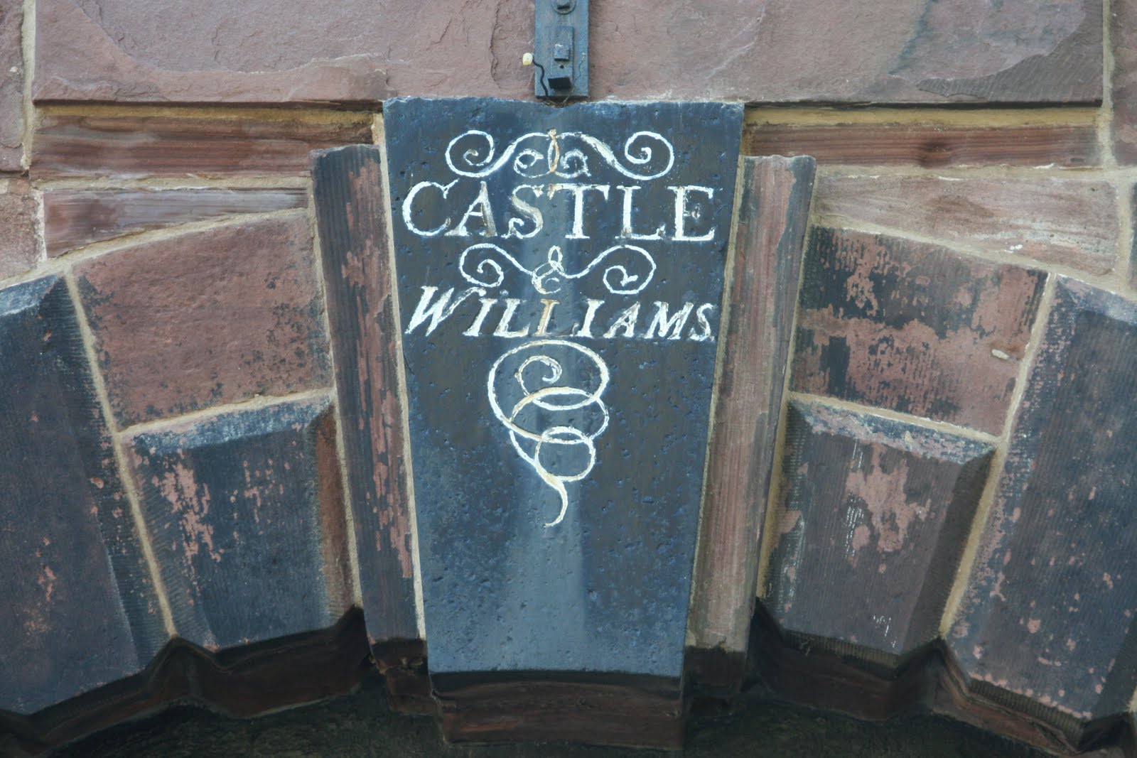

Here are two examples of lettering that I came across recently that illustrate good and bad flourishing. The bad example is from Fort William on Governor’s Island, the former Coast Guard facility that is now open to ordinary New Yorkers. The good example (A Sure Faust) is from a storefront near Raffetto’s on West Houston Street in Manhattan.
The Fort William inscription—unfortunately poorly painted—has crude curves and a tailpiece whose spiral gets tangled up at the end rather than finishing with a burst of vivacity. Part of the crudity of the curves is due to the medium, but clearly the stonecutter was not of the first rank.
A Sure Faust has been rapidly written on glass, probably with some kind of soap. The verve of the writer can still be felt in the flourishes on the e in “Sure” and t in “Faust” as well as with the underscore. These flourishes show how important body movement (whether it be fingers, hand, elbow or shoulder) is to achieving graceful and lively strokes. As so often happens with spontaneous gestures, the writing is not perfect. The first word (“A”) is only decipherable in context and the overlap between the S and F is too tight. But A Sure Faust—what does that mean?—is still a burst of sunshine on a cloudy day.
Monday, October 4, 2010
From the Archives no. 11: Woman’s Work?
This is a post that owes a big debt of thanks to Caitlin Dover, my former colleague at Print magazine. She is doing research on 19th c. signs in New York City and came across this intriguing reference to women signpainters. It is in The Employments of Women: A Cyclopaedia of Woman’s Work by Virginia Penny (Boston: Walker, Wise & Co., 1863), pp. 471–472. The entry, one of a long list of potential professions for women that defiantly avoids gender stereotyping, says in its entirety:
No. 508. Sign painting requires a long, steady, and regular apprenticeship. It requires also a correct eye and a steady hand. In large cities, sign and ornamental painting can be made a distinct branch of painting; but in a town or village it is combined with carriage or house painting, as one individual seldom has enough sign and ornamental painting to keep him constantly occupied. It is not more necessary for a painter to know how to mix the paints, and use judgment and taste in the selection of colors, than to form letters according to geometrical proportions. A painter must measure, more by the eye than a rule, the size and arrangement of letters in a given space. Good painters receive $3, $4, and $5 a day for their work, but generally are paid by the piece. When paid by the week, and they work regularly, they receive from $12 to $15 a week. Mrs. K, New York, says in Dublin there are many families that devote themselves to sign painting, but she knows of none in this country except her own. She employs a man to grind paints, put up signs, &c.,—also to paint out-of-door signs, that is, such as must be painted on the building. Her two daughters paint all the signs that are to be put up. Some of the large signs above stores in New York have been painted by them. They are paid as good prices as men. Her daughters received their instruction and advice from their father. In that way they acquired maturity of judgment and nicety of hand. Judgment needs to be exercised in regard to size and space, and artistic taste in ornamenting. A sign painter told me that superior workers can earn from $3 to $15 a day, if they have sufficient employment. Many house and other painters, in cities, profess to paint signs, but in reality have it done. Germans do much of it in New York, because they do it cheaply, but many of them do not execute their work well. It is customary to have an apprentice three years and pay the usual terms, $2.50 a week, the first year. A boy, during the first year, mostly grinds paints, goes errands, &c. Spring is the most busy season. Painting in oils is not neat work. A sign and carriage painter writes me: ‘The work is unhealthy on account of the poisonous vapors and dust. It requires two or three years to learn, and one must have a great deal of practice. A common education, natural taste, and a correct eye are the qualifications needed. Many parts of it are very easy and pleasant. Some parts might be done by women.’ The business pays best in large towns and cities. An ornamental painter writes me: ‘Women are employed in sign painting in England, France, Germany, and Belgium. The time required to learn would depend on the taste or genius of the individual. The qualifications requisite are those of an artist in a less degree.’ B., an emblematic sign painter, thinks the employment very suitable for females, but supposes there are better openings in other cities than New York. It requires two or three years to learn all the different branches well. During the first year a learner could not support herself, but after that could, if she had a taste for it, was industrious, and received enough orders to keep her busy.
It would be interesting to know how many women were employed as sign painters in New York City and other major American cities in the 19th century. As in the printing industry did they enter the profession through husbands or fathers? The three female sign painters specifically cited here apparently did so. Did that make them unique? There is much exciting research to be done.
Subscribe to:
Posts (Atom)