Friday, April 22, 2011

Ciao!


Ciao means both goodbye and hello in Italian. This is goodbye for Blue Pencil as a standalone blog, but it is hello to Blue Pencil as part of my new website. Click here http://www.paulshawletterdesign.com/ The website [nicknamed Shaw*] gathers together all of my myriad activities under a single umbrella in a manner that makes clear how they all stem from my deep and abiding love of letters in all of their variegated forms and uses. It is about making letters, designing with them, studying their history, investigating their habitats, and writing about their multitudinous manifestations.


I want to thank Greg D’Onofrio and Patricia Belen of Kind Company for their hard work and patience in designing the site and getting it up and running. There is still much more to do. In the coming year the site will deepen in material and broaden in content.


Thanks for supporting Blue Pencil in its original incarnation. And I hope to see all of you at Blue Pencil on Shaw*.


Thursday, April 14, 2011

Blue Pencil no. 14—Salon Manicure

Claire Lambrecht of Salon interviewed me on April 5 about my book Helvetica and the New York City Subway System. It was a very cordial interview. She asked me several questions and then let me ramble, uninterrupted before her next question. The whole interview, which took about an hour, was tape recorded, with my permission, on her end. The published interview appeared online on April 11.

I have no major complaint about the interview, just a tiny one. My side of the interview as published appears to be accurate. It sounds like what I said. However, her side of the interview is not exactly as I recall it. (I did not tape record the interview on my end.) Ms. Lambrecht and Salon have apparently edited her questions to make them crisper, clearer, more incisive. That is their right and it was what they should do. But I wish I had been accorded the same opportunity.

Since Salon did not offer me a chance to see the interview before it was published, I am using the bully pulpit of Blue Pencil to give my answers a manicure. I am not changing the gist of what I said or removing any gaffes. I am simply editing my answers to make them smoother and less discursive. I am adding some parenthetical comments to explain comments I made which may be opaque to non-type designers as well as some that are in reference to questions that were asked but do not appear in the Salon interview. I have also touched up a few of Ms. Lambrecht’s questions to make them clearer.

This is not meant as an attack on Ms. Lambrecht or Salon, only as a tiny corrective. I fully appreciate her efforts. You can read the original interview at:

http://www.salon.com/life/feature/2011/04/11/helvetica_interview

Claire Lambrecht, Salon

Loud, complicated, sprawling: The New York City subway is a national landmark as much as it is a transit system. From its 1904 inception, the New York City subway has grown into the largest unified transportation system in the Western Hemisphere -- one that includes more than 423 stations and 660 miles of track. But its breathtaking, and frequently overlooked, collection of signage -- from colorful mosaics to colored circles -- also offers fascinating insight into the popular conception of public transportation and the world in which we live.

Today, the modern subway is dominated by the Helvetica typeface: A clean, simple, unfussy font became a favorite of municipal planners and corporations in the postwar period. Prior to this redesign, however, the New York subway was a chaotic collection of signs and placards in various typefaces that more closely resembled the world of Dr. Seuss than the modern system we know today. In his new book, "Helvetica and the New York City Subway System," New School adjunct professor Paul Shaw explains how the efforts of designers -- including iconic graphic designers (and co-founders of the influential Unimark design firm) Massimo Vignelli and Bob Noorda -- as well as politicians and the public helped engineer that change, and what that overhaul says about urban infrastructure and ourselves.

Salon spoke with Shaw over the phone to find out Helvetica's revolutionary message, its effect on public transportation and what it tells us about New York City.

Where did Helvetica come from and why was it developed?

The typeface was created in a small town outside of Basel [Münchenstein] by one of the oldest typeface companies, Haas, which went back centuries [Haas’che Giesserei, established 1740]. They were not happy that one of the most popular typefaces among Swiss designers [in the 1950s] was a German typeface, Akzidenz Grotesk [from Berthold GmbH]. They wanted a typeface that was going to compete with it. They took Akzidenz Grotesk, studied it, and changed tiny aspects of it; which, when you add it up, created a new design. They didn't have much imagination when it came to the name. They called it Neue Haas Grotesk, which means the “new sans serif from the Haas company.” It wasn't exactly a barnburner in convincing people to get it—it didn’t really catch on among the Swiss designers. [Designers such as Armin Hofmann, Josef Müller-Brockmann, Max Huber and Karl Gerstner continued to use Akzidenz Grotesk while Emil Ruder and his students pledged their allegiance to Univers (Deberny & Peignot, 1957) designed by Adrian Frutiger.]

So how did a relatively unpopular typeface become the iconic "Helvetica" that we know today?

[Neue Haas Grotesk was not unpopular. It simply was not the sensation among Swiss designers that Haas expected.] It The Haas company was partially owned by a German company [D. Stempel AG]. They said, “We like this new design; we want to sell it in Germany and elsewhere.’ Stempel was brilliant and realized that Neue Haas Grotesk was not a good name. They wanted to call it “Helvetia,” the Latin name for Switzerland, but the people at Haas balked at this on the grounds that you can’t name a typeface after a country; that somehow it was insulting to Switzerland. But someone at Stempel had the brains to think, “Let's just add a ‘c.’” Helvetica is not only not a country, but it is easier to say. It was a brilliant solution.

How did Helvetica become so dominant?

It’s weird; it was almost an accident. Helvetica became dominant for basically two quirks of fate. It coincided with an interest in Swiss design worldwide in the 1960s. And it happened to get picked up by the right companies—and by the right technology. [Stempel owned German Linotype and thus was able to translate Helvetica to hot metal before its rival, Univers, was. And not only that, but being available in Linotype was better than being available in Monotype (as Univers eventually was) because Linotype dominated the newspaper and advertising markets. And Linotype had affiliated companies in the United States (Mergenthaler Linotype) and the United Kingdom (English Linotype) that could spread it widely.]

Why the 1960s?

The ’60s was the heyday of the idea that corporations needed an identity that could cut across all of their activities: their products, their materials, their services, their delivery systems, and their offices. It was part of the postwar international spread of corporations—especially American ones. They wanted to have a unified appearance.

What was it about “sans serif” typefaces (those without the tiny strokes at the end of strokes) that was so attractive then?

Designers were looking for typefaces that appeared objective or neutral; typefaces that didn’t suggest the past or have cultural meaning. There were a number of typefaces that fit the bill at the time, but Helvetica was the one that was available in the widest range of technologies. It was part of the Swiss zeitgeist. And so companies, as soon as it was available, began to make Helvetica their default face. People used to joke that you couldn’t tell one corporation from another because they all had Helvetica for their logos. [This was especially true by the early 1970s of American companies that were Unimark clients. But it was also true of German companies in the early 1980s as Erik Spiekermann has often pointed out.]

A lot of people are familiar with the New York City subway system of today. What did the subway look like 50 or 60 years ago? [This question was originally about what the subway system was like during the Mad Men era.]

There wasn’t a unified system of signs. You had ceiling signs, institutional signs, mosaic signs, column signs, and then, of course, you had billions of other signs: no smoking, no spitting and so on. All of this piled up. That’s what Don Draper [the protagonist of Mad Men] would have seen.

What happened in the postwar period that inspired [the] reform [of the New York City subway signage]?

People began to realize that if New York was going to be a world-class city—the heart of finance, art, publishing, and so on—something had to be done about this embarrassing transportation system. As we all know, it is incredibility effective, but it’s not very pleasant. The system is far better today than when I arrived in New York in the late ’70s; and yet there are days when I go down into it and I just start cringing. All of a sudden you realize that it does stink or that it is dirty—even if it’s far cleaner than it used to be. It’s an old system, one that’s been cobbled together system, which is really the one thing that separates it from every other system in the world.

Helvetica was developed in 1957 and was first available in New York in 1963 [as matrices from German Linotype which could only be used on American Linotype machines after being modified]. When did it make its way into the subway system?

It didn’t take over until decades after everybody thought it had. It didn’t become the official typeface until December 1989. Given that the first signage attempt was 1966, and the first manual was 1970, that’s a long time—but it crept in. It showed up before it officially “showed up.” You can tell that MTA still doesn’t fully know what it’s doing. Just last December they renamed ”Jay Street–Borough Hall” as “Jay Street–MetroTech.” I finally went over to see what everything looked like. I was stunned. They used the wrong Helvetica. It’s Helvetica, but it’s not the right one. [It is the wrong weight. This is also true for the new signs at Chambers Street on the IRT line.] It’s the same mistake that they made in the ’80s. They got confused. I can’t believe that that has happened again for an entire new station redesign because they take great pride in maintaining Helvetica as the identity of the system.

How did Helvetica reflect the ideology of its day?

Sans serif as a dominant typeface really goes back to the ’20s: to the Bauhaus and other modernist designers who were contemporaries of, but not members of, the Bauhaus. Sans serif was seen by all of these designers as a style of type that didn’t have historical roots. It seemed to be free of the past; to be a type that was contemporary. To them, it was something that was free of past associations and therefore was perfect for what they thought was a new world happening.

A lot of these designers were left leaning if not all-out communist, and they thought there were going to be revolutions in other countries [following the 1917 Bolshevik Revolution in Russia]. They saw designers as the new visual people, as “visual engineers”. They wanted type that seemed modern; that fit in with cars, skyscrapers and things like cinema and photography. And thus sans serifs became part of modernism. These designers also saw sans serifs as free from decoration. They wanted letters that were as simple as possible. Sans serifs were stripped-down—it was part of the machine aesthetic of the time. The letters aren’t obscured by unnecessary parts. Sans serifs have been associated with modernism ever since. Even today there’s still a sense that if you want to indicate that you are modern, you use a sans serif letter form. Tech companies love them. Architects love them.

How does that manifest itself in the New York subway system?

If this is the typeface of the modern world, especially modern corporations, then it’s also the typeface of modern transportation. It’s amazing how a subway station with a Helvetica sign looks newer than the same station with just mosaics. If you doctored photographs, you could quickly modernize the New York City subway system just by changing the signs.

What does the story of this typeface tell us about New York City?

What was most surprising about this whole thing was that I thought I was just writing a short article about “Is it Helvetica or is it Standard and why?” [meaning the signage that Massimo Vignelli and Bob Noorda of Unimark specified in 1966 and again in 1970] and instead I found myself writing about “What happened and why?” and “Why did things go downhill but somehow they’re still working?” “How have things changed and yet they haven’t changed?” And that’s what began to fascinate me: how what Vignelli and Noorda did in ’66 is still with us today, even though neither of them hasn’t been involved since 1970. What we have today is not what they did. We have a different typeface, we have different colors, we have a different system of signs [referring to the abandonment of Noorda’s concept of modularity]. We have all of these things that are different, and yet, when you look at it, there is an essence that is there that they established. It’s survived how many mayors? how many heads of the subway? how many budget crises? It’s even survived graffiti. If you’re asking what symbolizes New York, it’s not Helvetica. It’s how what Vignelli and Noorda did has survived. That’s very New York. It doesn’t matter that everything around them has fallen apart; their system is still here.

Note: When I have done interviews for Print and other publications they have been conducted by email rather than telephone. Thus, there has been no need to interpret what someone said. However, I have taken the opportunity to smooth out grammatically and syntactically responses from interviewees. The intent is to achieve an interview that, although not verbatim, is true to the intent of both parties and is as clear as possible to the average reader. This has been done with consent of the interviewee as I always send him/her an advance copy of the edited text for approval before being published or posted. However, interviewees are not allowed to change or delete things which they said have subsequently regretted, only to verify that my edits have not materially changed their answers.

Tuesday, April 12, 2011

Blue Pencil no. 13—Standard Deviations (exhibition)

Standard Deviations: Types and Families in Contemporary Design
Museum of Modern Art
Paola Antonelli, Senior Curator and Kate Carmody, Curatorial Assistant
2011

The Museum of Modern Art exhibition showcasing its new digital font acquisitions contains a short glossary of type terms. It is not only inadequate but it is inept. Here are all of the definitions and my comments on some of them.

Bitmap typeface A typeface in which the letterforms are composed of pixels, or “bits,” unlike a vector typeface, in which each letterform is rendered as a single outline.
Cathode ray tube (CRT) Similar to an early television, a CRT monitor renders images in large pixels on a grid.
[This not entirely true as early CRT machines used scan lines to render images. Cathode ray tubes in typesetting are the same as those found in television sets. The CRT emits a beam of light that is etched on a surface.]

Character An individual letter, also called a glyph or letterform.
[This collapses the critical distinction between a letter (or letterform), a character and a glyph. A character can be a letter, but it can also be a figure (numeral), a punctuation mark or a symbol. Glyphs, in typography, are graphical units and as such they encompass and go beyond characters to include writing marks in non-Latin languages.]
Descender The part of a letter that reaches down below the baseline of the font, in g, p, and q, for example.
[This definition is slack. It not only leaves out j and y but it could include the tail of Q which descends but is not considered to be a descender. Furthermore, ascender, descender’s more significant counterpart, is not included.
Font A specific size and style of type within a typeface, for example, Helvetica 10-point italic is a different font than Helvetica 9-point bold. Since the digital revolution, “font” has been used colloquially to mean type family or typeface.
[This is a very confusing and inaccurate definition. The word has shifted meaning over time. Theodore Low De Vinne, in Plain Printing Types (New York: The Century Co., 1899) defines a font of type as “a complete collection, with a proper apportionment to each character, of the mated types required for an ordinary text.” (p. 165) This is a reminder that in metal type you need more than one of each character to compose a text. A font is thus like a Scrabble set with a differing frequencies of characters depending on language (see p. 167). As De Vinne says, “The type-founder tries to supply each character in proportion to its frequency of use, so that the printer shall have enough of every and not too much of any character.” (p. 165) A scheme or bill of type varies not only from country to country but also between metal and wood. But it does not normally vary by point size.

De Vinne shows (p. 166) one scheme of type in which there are 226 characters: A and a (5 each), B and b (3 each), C and c (4 each), D and d (4 each), E and e (6 each), F and f (3 each), G and g (3 each), H and h (4 each), I and i (5 each), J (3) and j (2), K and k (2 each), L (6) and l (5), M and m (4 each), N and n (5 each), O and o (5 each), P and p (3 each), Q and q (2 each), R and r (5 each), S (6) and s (5), T and t (5 each), U and u (4 each), V and v (3 each), W and w (3 each), X and x (2 each), Y and y (3 each), Z and z (2 each), period (4), comma (4), semicolon (2), colon (2), hyphen (1), apostrophe (2), exclamation point (3), dipthongs (1 each but lowercase only), f-ligatures (1 of each: ff, fi, fl, ffi, ffl). A font refers not only to the frequency of characters but also the complete set of characters. De Vinne outlines a “so-called complete font” for roman and italic type of 253 characters (p. 169). Along with letters, figures and punctuation there are fractions, money signs, reference marks (e.g. pilcrows or fists), braces, dashes, leaders, space and quadrats, and miscellaneous marks (e.g. @ or the degree mark).

In the digital era font does indeed refer to the design of a typeface—but not to a family of typefaces. Instead a family is a collection of related fonts. And font still has nothing to do with point size since digital type is largely size-independent unlike metal type.]
Glyph See character.
[See comment above about the definition of Character.]
Joining stroke A line that connects two letters, as in cursive handwriting.
[In calligraphy usually called a join. Joins can exist in non-cursive hands as well as non-script typefaces. See quaint ct and st ligatures as well as the unusual characters in Matthew Carter’s Walker typeface.]
Leg The part of the character that extends outward from the stem. For example, a leg is what distinguishes R from P.
Letterform See character.
[See comment above about the definition of Character.]

Ligature A single character that represents the connection of two letters.
[Ligatures can consist of more than two letters. This is especially true in textura. Gutenberg’s fount had a number of three-letter ligatures. True ligatures involve overlapping strokes that subliminate the identity of the original letters. This is why ct and st ligatures (and their ilk) are characterized as “quaint”. They are only ligatures by virtue of an extraneous stroke.]
Point size The size of a font, based on its x-height. There are 72 points per inch.
[Point size is not the “size of a font, based on its x-height” but, in metal type, of the metal body bearing the character. This height was larger than the distance from the bottom of a descender to the top of an ascender. In digital type the measurement is similar, except that now there is no physical object, just a bounding box. Typefaes with the same nominal point size can have wildly divergent visual sizes. This concept should have been illustrated in the glossary. (Furthermore, it is only with Postscript that 72 points equal exactly one inch. In the Didot system, 72 points equals 1.186 inches and in the Anglo-American system—the one that dominated in this country until the advent of the Macintosh computer—it equals .9936 inches.)]
Serif A short line that extends from the top or bottom of a stroke in a letter. It is a symbolic leftover from handwriting.
[A short line that extends from the top or bottom of a stroke in a letter,” the first part of the definition of serif, is merely incomplete. But the second part—“It is a symbolic leftover from handwriting.”—is laughable. A serif is a tiny stroke (not necessarily a line) that terminates a principal stroke of a character. Serifs are not confined to letters and they may be found on horizontal and curved strokes as well as on vertical ones. They derive from formal lettering, not handwriting; and, although their functional value has been a matter of debate, they are certainly not symbolic holdovers.]
Stem The part of a character that is a vertical line, as in F or h.
[The stem of a letter is also called a spine.]
Strokes The lines from which a letter is formed; a lowercase h, for example, is composed of two strokes: a stem and a leg.
[Why is this plural? Depending on the nature of the lowercase h, it can be composed of one, two or even three strokes. A cursive h such as that found in roundhand is a single continuous stroke, complete with loop. A constructivist h composed entirely of straight lines (so that it resembles a chair in profile) has three strokes. See The Stroke: Theory of writing by Gerrit Noordzij for an extended and influential discussion of the concept of stroke in writing and calligraphy and its relevance to type design. http://www.hyphenpress.co.uk/books/978-0-907259-30-5]

Swash An exaggerated serif that embellishes a letterform.
[A swash is not an exaggerated serif. It is an extended stroke that embellishes or decorates a letterform.]
Titling face A typeface designed to be used in large sizes for titles or headlines.
[The traditional definition of a titling face is a typeface consisting solely of capitals, lining figures and punctuation. Its letters are larger than usual because the absence of lowercase letters (specifically descenders) allows the full area of the typeface (literally the face of the metal type body) to be used. Titling typefaces tend to have stunted Qs and non-descending Js. The name comes from the common use of such large letters on the title pages of books. The concept of a titling face is of little relevance in digital type where size is no longer controlled by the typefounder. The only instance where it still has a bearing is to describe typefaces that do not have full character sets, but instead are limited—such as my Kolo, Donatello and Bermuda—to capitals, lining figures and punctuation. Such typefaces are no longer limited to titles or headlines.]
Typeface A set of letters in different sizes and styles, united in form and look, that are designed to be used together. Also called a type family or face.
[Originally, typeface referred literally to the design of the character on the face of a piece of type metal. From there the term has come to mean the design of a group of related characters (not only letters) “united in form and look” but not comprising “different sizes and styles”. A typeface is not the same as a type family. The latter is a set of related typefaces, most often various weights and widths of a roman and its companion italic. Increasingly, the definition of family has been stretched to include serif, sans serif and mixed serif variants. Getting this term wrong undermines the whole notion that Standard Deviations is about types and families.]

Vector typeface A typeface in which each letterform is rendered as a single outline, unlike a bitmap typeface, in which each letterform is composed of a collection of pixels.
x-height The height of the lowercase x in a typeface, upon which the heights of all other characters are based.
[This is overly literal and it puts the cart before the horse. The x-height (the z-height in older American books on type) describes the height of the body of a lowercase letter and is only meaningful as a guide to the proportion of the body to the ascender height first, the capital height second and the descender depth third. The height of the x (or the z) is merely a convenience and not what the type designer is really concerned about.]

I sent the Museum of Modern Art glossary and my comments to James Mosley, former librarian at St. Bride’s Printing Library in London and type historian par excellence (typefoundry.blogspot.com) to get his feedback. Here are some of his views on the terms under consideration here. Note that they do not always agree with mine, indicating how difficult some of these terms are to define, both across specialties such as calligraphy and type design but as well across languages (including British and American English).

"Font" is a curiosity. I instinctively insist that in historical terms it is equivalent to a "casting" of type at one time from one set of matrices, so that another quantity, cast on another occasion, even from the same mats (as we typefounders know them), would be strictly a different "font", to be kept in different cases—and quite wisely, since it might have come from a different mould, and might have a different alignment and set and even a slightly different body.

But I keep coming across historical instances, quite old ones, where “font” or “fount” is clearly a synonym for "design", as in our rather loose present-day usage.

I am not nearly consistent in my own use of this kind of term. I do find "letterform" a quite useful global term for designs that are common to "type and calligraphy", attempting to make "letterform" an equivalent to the universal German term "Schrift"—but I am not sure if many people understand what I am trying to do. [I tend to use “letterform” in this manner as well.]

"Ligature" is another fossilized survival from writing and also from metal type, and it can be made from three letters (ffi) as well as two. When the original letters cannot be made out (which is generally true of the roman form of &) I do not think it should be called a ligature—perhaps having become a "glyph", for want of a better term.

I flatly decline to get involved in defining a "serif". [Too bad as this is a very contentious term and it could use some standardization.]

Discussing the "point" is pretty pointless, but after that odd period in the 1960s (or when ever it was) when zealous typographic theorists were wanting to insist on a metric scale, we seem to have gone back to them, because they are easy to grasp as a system that gives a pretty universal visual picture. Doesn't matter if we are using a seventy-second of an inch (which is a sop to the anti-metric US population) or the older point of 0.0138 inch or 0.351 mm (or is it 0.3515 mm?). If I say ten points, or fourteen, you will know pretty well what I mean. The world seems to be accepting that Fournier didn't invent the point, but stole it (from Truchet). [On this latter point see Mosley’s blog.]

The entry for "x-height"—something "upon which the heights of all other characters are based"—is essentially wrong. Reading something as confused as that makes me want to throw the whole thing away, a long way away. Pity, since a good vocabulary of this kind, well-informed and handled by someone with a grasp of clear, simple language, like Carter père (and indeed Carter fils too) [Harry and Matthew Carter respectively] can improve one’s own technical language.

Saturday, April 2, 2011

From the Archives no. 18—Satz- und Druck-Musterheft 1938


Satz- und Druck-Musterheft 1938
Vorlagenheft für Setzer, Drucker, Werbefachleute, Graphiker und Reproduktionstechniker

Berlin: Verlag der Graphischen Monatsschrift “Deutscher Drucker”, 1938


Satz- und Druck-Musterheft 1938, a printing trades periodical, is another instance where I wish I was able to read more than a few words and phrases in German. (The translations here were done with the kind help of Indra Kupferschmid who also helped with proofreading the German.) It is a compendium of articles about printing, typography and design coupled with numerous advertisements for type foundries, printing press manufacturers, ink and chemical manufacturers, and paper companies. As such it presents an intriguing snap-shot of graphic design and typography in Nazi Germany. Other than flags and uniforms in a single photograph of Nazi party members marching, there are only two swastikas in the entire publication!

Most of the articles are written by Fritz Genzmer (1888–?), a longtime author of articles and books on the printing industry who was still active into the late 1970s. Others appear to be reprinted from other printing magazines since they bear dates from 1936 and 1937. Several of them are written by Willy (or Willi) Mengel who also had a long career writing about printing and type. Finally, there are articles in the annual showcase printing and design schools.

Genzmer is best known for Das Buch des Setzers, a basic guide to German typefaces. The first edition was published in 1936. The one displayed on the Luc Devroye’s website is from the sixth edition (1948) and Helvetica Forever refers to an edition from 1967 in footnote 80. See http://cg.scs.carleton.ca/~luc/Genzmer1948/. The 1948 edition covers the typefaces of twelve German foundries (Bauersche Giesserei, Ludwig & Mayer, D. Stempel, H. Berthold, Norddeutsche Schriftgiesserei, Genzsch & Heyse, Gebr. Klingspor, J.G. Schelter & Geisecke, Ludwig Wagner, Schriftguss AG [formerly Brüder Butter], J.D. Trennert und Sohn, and C.E. Weber), dividing them into either blackletter or antiqua. See the downloadable PDF at http://www.sanskritweb.net/fontdocs/genzmer.pdf.

Genzmer’s articles are “Buchtitel in Fraktur und Antiqua”, “Behördliche Drucksachen”, “Normdrucksachen in zeitgemäßer Gestaltung”, Asymmetrie oder Mittelachse?” and Der Gebrauchstypograph Thannhaeuser”. Buchtitel in Fraktur und Antiqua” (Book Titles in Blackletter and Roman) is one of several items in the periodical devoted to this persistent German question: blackletter or roman type? The text is set in Jiu-Jitsu, a casual script, with the title in a “sans serif” script named Knock-out [not to be confused with Knockout from Hoefler & Frere-Jones]. The nine samples accompanying the article, designed by Arthur Murawski, employ a mix of blackletter and roman types. For the purposes of this article roman includes serif and sans serif types as well as scripts; while blackletter includes textura, rotunda, schwabacher and fraktur as well as Schaftstiefelgrotesk [“jackboot gothic”] types*. The latter are modernized texturas that have often been associated with the rise of Nazism, hence the perjorative nickname. Actually, they are better seen as blackletter counterparts to the new geometric sans serifs emerging at the end of the 1920s. See my article “Lead Soldiers” in Print LII:III (July/August 1998) and reprinted in Texts on Type: Critical Writings on Typography edited by Steven Heller and Philip B. Meggs (New York: Allworth Press, 2001).

*hereafter, I will use the German word as an import into English and not capitalize it or italicize it.
ROMAN
Knock-out
Walbaum-Kursiv (twice)
Normande
Plastica (similar to Umbra)
Berthold-Grotesk-Kursiv
City halbfett and fett
Bayer-Kursiv halbfett
Royal-Grotesk
BLACKLETTER
Walbaum-Fraktur
Bismark-Fraktur
Trump-Deutsch (twice)
Deutschland-Kursiv (a Schrägschrift or inclined textura)
Four designs combine a blackletter and a roman; two use two blackletter faces; and the remaining three match two roman faces (one of which combines two sans serifs). There are no schaftstiefelgrotesks.

Genzmer’sBehördliche Drucksachen” (Official Printed Matter) article is set in an unidentified Venetian Oldstyle (or, as the Germans would call it, Venezianische Renaissance-Antiqua) with the title in Manuskript-Gotisch. The accompanying samples are entirely in blackletter typefaces, yet the layouts are often asymmetrical in the manner of die neue typographie! The typefaces are: Psalterium, Leibniz-Fraktur, Schmale halbfett National (a schaftstiefelgrotesk), Alemannia-Fraktur, Krimhilde mager and halbfett (a monoline script with fraktur structure), and Wallau.


“Normdrucksachen in zeitgemäßer Gestaltung” (Contemporary Standardized Printed Material) is set entirely in Walbaum-Antiqua. The seven samples, once again by Murawski, are a wild mix of blackletter and roman types. The designs are stationery and many are laid out in a modernist asymmetrical manner. Four use both blackletter and roman and three are set entirely in roman types. None are entirely in blackletter types. The only schaftstiefelgrotesk is a schrägschrift.
ROMAN
Bodoni-Kursiv (5)
City
Berthold-Grotesk (4)
Normande
Ariston
Walbaum-Antiqua
Walbaum-Kursiv

BLACKLETTER
Trump-Deutsch (3)
Bismarck-Fraktur (3)
Deutschland-Kursiv
Mainzer-Fraktur

Genzmer’s article “Der Gebrauchstypograph Thannhaeuser” (The Commercial Typographer Thannhaeuser) is a profile of Herbert Thannhaeuser (1898–1963), graphic designer and type designer. It is appropriately set in his Parcival-Antiqua (Schelter & Giesecke, 1926), a neoclassical typeface. The examples of his work utilize a number of faces, only a few of which I can identify: Baskerville, Memphis and Mundus Antiqua. The only blackletter is Deutschschrift and it appears once.


“Asymmetrie oder Mittelachse?” (Asymmetry or Middle-Axis [Symmetry]?) by Genzmer is as much a burning question of the time as fraktur vs. roman, though it is surprising to see it out in the open in Nazi Germany, especially as late as 1938. Jeremy Aynsley, in Graphic Design in Germany 1890–1945, writes, “A final gauge of the impact of the new typography [which advocated asymmetrical layout] can be taken from the adverse reaction it prompted…..” (p. 185) He then goes on to quote (pp. 185–188) from a 1937 Penrose Annual article by Gustav Stresow complaining that modernist typography was too radical a break with the past, that it failed to take into account “the power of tradition”. Stresow defended the return to fraktur (meaning all blackletter) as an essential aspect of the German language. Aynsley does not mention Satz- und Druck-Musterheft in his text nor is it (or Fritz Genzmer) in his bibliography.


The article is set entirely in Gotenburg (D. Stempel, 1935), Friedrich Heinrich, a textura that is simplified but not mechanical like a schaftstiefelgrotesk. The ten accompanying pairs of illustrations show texts set both symmetrically and asymmetrically for an objective comparison of their merits. Both roman and blackletter typefaces are used: Stempel Garamond, Bodoni, Stempel Sans (also known as Neuzeit Grotesk), Memphis, Mundus Antiqua; Magere Gotenburg and Schmale Tannenberg, a schaftstiefelgrotesk. Genzmer says, “Asymmetrie also ist Leben, Bewegung, Schwung; Symmetrie Ruhe und Beharrung.” (“Asymmetry is thus life, motion, verve; symmetry is rest and equilibrium.”) He describes the debate over which is more appropriate to modern times, thusly,

Asymmetrie gegen Mittelachse, Bewegung gegen Ruhe, eines aus der Zeit geboren, das andere verwurzelt in beschaulichen Bezirken ruhigerer Zeitläufe. Was steht dem Sinn und den Wünschen unserer Generation näher? Sind die Argumente, die für die asymmetrische Satzgestaltung sprechen, stark genug, um ihre form zu rechtfertigen? Ist uns Modernen auch die Mittelachse noch erträglich, vielleicht, weil unser Sehnen aus der Zeit der Unruhe wieder zur Ruhe drängt? Wenn nämlich nicht alles trägt, haben wir schon den ersten Schritt auf dem Wege zurück zu ihr getan. Oder ist der Odem unserer Zeit so stark, daß unser Aderschlag in allen Außerungen den gleichen Rhythmus hat? Die objektive Gegenüberstellung unsere Beispiele kann vielleicht die Antwort darauf geben.

Asymmetry versus symmetry, motion versus rest; one born out of its time, the other rooted in the placid districts of the calmer courses of time. What is closer to the mind and wishes of our generation? Are the arguments advocating asymmetrical design strong enough to justify its form? Is symmetry still tolerable for us as modern people, perhaps because a time of unrest has made us crave tranquility again? Because, if all of this does not give way, we have already made the first step on the way back to it. Or is the spirit of our time so strong that our pulse, in all of its expressions, has the same rhythm? The objective comparison of our examples might be able to provide an answer to this.

Genzmer concludes by asking the readers of Satz- und Druck-Musterheft to weigh in with their opinions on the subject. Perhaps their responses appear in the 1939 issue.


Willi Mengel wrote articles for Gebrauchsgraphik, Archiv für Druck und Papier, Druck, Papier und Druck, Typographische Monatsblätter and other publications well into the 1970s. He was also the author of Ottmar Mergenthaler and the Printing Revolution (Brooklyn: Mergenthaler Linotype Company, 1954) and Druckschriften der Gegenwart: Klassifiziert nach DIN 16518 (Stuttgart: Blersch, 1966). In Satz- und Druck-Musterheft 1938 he contributed three articles. The first is “Die Eigenwerbung des Buchdruckers” (The Self-Promotion of the Printer). Its text is set in Bodoni with title in Wallau. The examples are set in a mix of faces, many of them scripts. The combinations are: Allegro and Candida; National and Erbar-Grotesk; Skizze and Tempo; Allegro and Welt-Antiqua (a square serif face like Memphis); Altenburger-Gotisch and Erbar-Grotesk; Welt-Antiqua and Skizze; and, by themselves, National and National Schräg. National is a schaftstiefelgrotesk and its pairing with Erbar, a geometric sans serif, reinforces my view that such faces were seen by their designers as modernized blackletters, suitable for those who wanted to maintain “Germanness” while working in the new typographic style of the time.


“Der Bilder-Umbruch in der Zeitung” (Picture Composition in Newspapers) by Mengel is reprinted from the March 1937 issue of Deutscher Drucker. It is in this article that a photograph of Nazi party members marching with flags appears. The layout is by Walter Zahn. The text is set in Baskerville with title in Wallau. (Wallau appears over and over again in Satz- und Druck-Musterheft 1938, but never in the later “German” version with revised capitals.) The newspaper examples, not surprisingly, are all set in various frakturs. However, some of the article titles are in Futura and Fanfare (1927), a heavy, expressionistic display face by Louis Oppenheim (1879–1936) which inhabits the middle ground between textura and sans serif.


Mengel’s third article is “April… der macht, was er will!” (April … Does its Worst!). Once again it is set in Baskerville with Wallau for the title. An unidentified italic is used for the subtitle. The sample designs are all in either various blackletters or typewriter fonts with the exception of some in Futura.


The anonymous J.W. is the author of “Der Zeitschriftenumschlag als Werbefaktor” (Magazine Covers as an Advertising Vehicle). It is set in Baskerville with Wallau for the title. (This must have been the default style of Satz- und Druck- Musterheft, a blend of blackletter and roman.) The sample designs are in Bodoni, blackletter (some handlettering, but also National) as well as various sans serifs (some handlettering alongside Futura). The captions to the illustrations are set in Futura.


Rudolf Franke (brother of Karl Franke? see below), wrote “Das Photo in der Akzidenz” (Photos in Jobbing Work). The title and text are set in a Venetian Oldstyle. The samples are set in the same Venetian Oldstyle, Super-Grotesk (a Futura clone), Splendor (a script), and Fette Fraktur.


Karl Franke (1894–1952), a proponent of the New Typography (See http://wiedler.ch/felix/books/story/387 which traces the history of Typographische Mitteilungen from 1930 to 1933), contributed “Typographische Korrektheit und Deutscher Stil” (Typographical Correctness and German Style). It is set entirely in Wallau. The typography, by Franke, is beautifully done using a light weight of the typeface with generous leading. The samples are set in a mixture of blackletter and roman: Claudius, Kleist Fraktur, Wilhelm Klingsporschrift, Offenbach, Wallau, and Kurrentschrift; and Orpheus and Tiemann-Antiqua. The typefaces are all from Gebr. Klingspor.


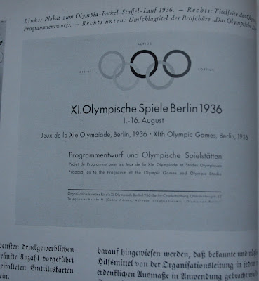
One of the most important articles in Satz- und Druck-Musterheft 1938, from a design history perspective, is “XI. Olympiade Berlin 1936” by Georg Wagner. This is a survey of the graphic and visual design associated with the famous 1936 Berlin Olympics, the Olympic games in which Jesse Owens and Ralph Metcalfe ruined Hitler’s dream of showcasing Aryan athletic supremacy.


(See http://www.ushmm.org/museum/exhibit/online/olympics/, http://en.wikipedia.org/wiki/Jesse_Owens and http://en.wikipedia.org/wiki/Ralph_Metcalfe.)


The title is set in Stempel Garamond with the subtitle in a baroque fraktur (Breitkopf Fraktur?). The text is set entirely in the same fraktur. The captions are set in Linotype Garamond Italic (based on Stempel Garamond). However, the images rarely include any blackletter. The posters, including several by Ludwig Hohlwein, are handlettered in classical roman capitals, fat faces or sans serifs. The brochures and other publications are set almost entirely in Futura (an unidentified seriffed roman is used for one written in Polish) with one exception. The covers of Olympiaheft are all handlettered (?) in the schaftstiefelgrotesk style. (Also see covers at http://www.flickr.com/photos/vintage_album/433898885/ and http://www.flickr.com/photos/vintage_album/433898883/) Programs for the Games are entirely in Futura. Stationery is in both an Old English (perhaps Manuskript-Gotisch or Caslon-Gotisch) and an unidentified seriffed roman. Finally, the mastheads of the different language versions of the Olympic Games News Service vary with most in an Old English, some in italic, and some in a roman. It is clear that the posters and publications intended for a non-German audience are in roman while those for Germans are in blackletter. However, the signage lettering that is shown is all Futura or a Futura clone.


The schools that are profiled in Satz- und Druck-Musterheft 1938 are the Berufschule für das graphische Gewerbe Berlin, Die Städt. Handwerkerschule Breslau, the Meisterschule für Deutschlands Buchdrucker in München (where Paul Renner and Jan Tschichold previously taught), the Gewerbeschule Zwickau (SA), Arno Schmeisser Gewerbeschule Zwickau (SA), and the Buchdrucke-Lehranstalt in Leipzig. The article on the Berufschule für das graphische Gewerbe Berlin focuses on layout and typography (Entwurf und Satzgestaltung / Layout and Typography) from the 1935/1936 winter semester. The article is set in Renata (a fraktur) for the text with Fette Fraktur for the title and Bodoni-Kursiv for some of the subheads. The initial capital is in Quick, a script typeface similar to Trafton Script. The samples of student work employ both blackletter and roman typefaces: Manuskript-Gotisch with Bodoni-Antiqua and Bodoni-Kursiv; Fette Antiqua with Quick; Weiss-Gotisch with Bodoni-Antiqua and Beton (a square serif); Manuskript-Gotisch with Corvinus-Antiqua and Corvinus-Kursiv; Futura with Quick and Flott (a heavy monoline script); and Manuskript-Gotisch with Quick. (Corvinus, designed by Imre Reiner, is an Art Deco-inflected neoclassical face issued in 1934 by Bauer.)


The contribution from the Meisterschule für Deutschlands Buchdrucker in München is from February 1937. It focuses on “Deutsche Druckschrift”—the introductory text (set in Walbaum-Antiqua with Trump-Deutsch for the title) ends with “Heil Hitler!” The work uses Walbaum-Fraktur, Manuskript-Gotisch, Trump-Deutsch, Ganz Grobe Gotisch (a chunky textura by F.H.E. Schneidler), Janson, an unidentified fat face and Futura. Georg Trump, designer of Trump-Deutsch, was a student of Schneidler’s. He was the director of the Meisterschule für Deutschlands Buchdrucker after Renner was dismissed by the Nazis. His tenure lasted from 1934 to 1953.


The article on the Buchdrucke-Lehranstalt in Leipzig, in celebration of its fiftieth anniversary, touts the school’s history. The text, set in Zentenar (as is the title and the captions), concludes with the exhortation, “Heil Hitler!” The work is set in a limited mix of blackletter and roman from Bauersche Giesserei: Weiss-Gotisch, Weiss-Antiqua, Weiss Initials and Futura. The Weiss faces are by E.R. Weiss (1875–1943), one of the leading German book and type designers of the pre-World War II era. (See http://www.klingspor-museum.de/KlingsporKuenstler/Schriftdesigner/Weiss/ERWeiss.pdf and the forthcoming book by Gerald Cinamon.)


The examples of book design from Die Buchgewerbliche Abteilung der Gewerbeschule Zwickau (SA) show Akzidenz-Grotesk, Stempel Sans, Wilhelm-Klingsporschrift and Metropolis. The latter is an Art Deco face designed by W. Schwerdtner (D. Stempel, 1928). The page about Die Städt. Handwerkerschule Breslau does not include any samples. The text is set in Zentenar with subtitles in a fat face (possibly Fette Antiqua). Neither does the page for the Arno Schmeisser Gewerbeschule Zwickau (SA). Its text is set in Wilhelm-Klingsporschrift combined with handlettered roman. A swastika hovers behind the heading, “Saar-Wettbewerb 1934” and the acronym N.S.L.B. (Nationalsozialistische Lehrerbund / National Socialist Teachers League) is emphasized. (Wikipedia says, “After the Nazi takeover of power in 1933 the Nazi Party validated the NSLB as the sole organization of teachers in the German Reich. In July 1935 the NSLB was merged with the existing organization of lecturers to form the

Nationalsozialistischer Deutscher Dozentenbund (NSDDB) (National Socialist German University Lecturers League).”


It should be remembered that the typefaces in Satz- und Druck-Musterheft are all metal, either foundry or Linotype. Those that are shown in the school sections represent those that each school’s print shop had in stock.


This rest of this post is a census of the typefaces used in the advertisements in Satz- und Druck-Musterheft 1938. Many of them are identified in captions, but most are not. I have relied on the Encyclopedia of Typefaces by W. Pincus Jaspert, W. Turner Berry and A.F. Johnson (London: Cassell, 2008) and other English-language sources, but they are remarkably deficient when it comes to German typefaces. Unfortunately, I don’t have a copy of Genzmer’s book from the 1930s. That would be the perfect source for this project.


Among the companies that advertised in Satz- und Druck-Musterheft 1938 are a number of typefoundries. They are Baeursche Giesserei, Gebr. Klingspor, D. Stempel AG, Schleter & Giesecke AG, Schriftguss KG (formerly Brüder Butter) and Mergenthaler Setzmaschinen-Fabrik GmbH. Bauer appears in several places in the annual. They have an advertisement on the back cover, several pages of type samples inside and a page devoted to their famous poster (in black-and-white), the Stammbaum der Schrift (Family Tree of Type), a famous poster created as part of the company’s centennial in 1937. And they provided the type (Schneidler-Initialen, Schneidler-Medieval and Legende) for the front cover. The advertisement on the back cover combines Legende and Futura. The sample pages are for Gotika (a stylized textura designed 1933 by Imre Reiner [1900–1987]), Renata with Weiss Initials, Weiss-Fraktur with Weiss-Schmuck (ornaments), Corvinus combined with Flott, and Element (the first schaftstiefelgrotesk, designed in 1933 by Max Bittrof [1890–1972]). Reiner was another student of Schneidler’s. (See http://www.klingspor-museum.de/KlingsporKuenstler/Schriftdesigner/Reiner/ImreReiner.pdf and http://www.klingspor-museum.de/KlingsporKuenstler/Schriftdesigner/Bittrof/MaxBittrof.pdf)

Gebr. Klingspor contributed type specimens for typefaces designed by Walter Tiemann (1876–1951). They are both roman (Orpheus and Orpheus-Kursiv, Tiemann-Antiqua, Tiemann-Medieval) and blackletter (Kleist-Fraktur, Fichte-Fraktur and Tiemann-Gotisch). Other faces by Tiemann (Peter Schlemihl, Narziss and Daphne) are simply listed. Surprisingly, Klingspor’s preeminent type designer, Rudolf Koch, is not promoted. (For more on Tiemann see http://www.klingspor-museum.de/KlingsporKuenstler/Schriftdesigner/Tiemann/WTiemann.pdf)


D. Stempel AG contributed specimen pages for Deutsche Werkschrift (a fraktur by Koch), Tannenberg (a schaftstiefelgrotesk by Erich Meyer) and Memphis (by Rudolf Wolf); and separate four-page sections for Gotenburg and Schmale Tannenberg. The latter, titled “Die schöne deutsche Schrift”, paired Schmale Tannenberg variously with Breitkopf-Fraktur, Bodoni, an unidentified egyptian (perhaps Schelter-Egyptienne), and Venus-Grotesk. The insert for Gotenburg, designed by Friedrich Heinrichsen (like Meyer, a Koch student), promotes it as the “truest German typeface”:

Leitgedanke bei Schaffung de Gotenburg war: Deutscher Wertarbeit zu leisten.

Wir sind der Überzeugung, in der Gotenburg eine neue gotische Schrift geschaffen zu haben, die nicht nur heute als gegenwartsnah empfunden wird, sondern auch für die Zukunft eine hohe Leistung deutscher Schriftkunst darstellt und bleibenden Wert hat. Sie steht auf dem Grunde der Überlieferung und ist zugleich ein neuzeitlicher Ausdruck des gotischen Schriftstils.

Gotenburg die echt deutsche Schrift.


The main idea behind the design of Gotenburg was to achieve high-class German workmanship.
We believe that we have created a new blackletter with Gotenburg which we perceive as timely for today. It also demonstrates the great achievement of German typeface design for the future and will be a typeface of permanent value.
It is based on tradition and, at the same time, a modern expression of the blackletter style. Gotenburg, the genuine German typeface.

Gotenburg is a simplified textura, but it is not a schaftstiefelgrotesk.


Mergenthaler Setzmaschinen-Fabrik GmbH, commonly known as German Linotype, provides the largest showing of typefaces with a page each for the following blackletters: Linotype Deutsche Werkschrift, Linotype-Unger-Fraktur, Linotype-Breitkopf-Fraktur, Linotype-Luthersche-Fraktur, Linotype-Tannenberg, Linotype-Heinz-König-Schmalschrift (a schwabacher), Linotype-Koch-Fraktur, Linotype-Ehmcke-Schwabacher; and a page each for the following romans: Linotype-Original-Baskerville, Linotype-Garamond (Stempel Garamond not Garamond no. 3), Linotype-Bodoni, Linotype-Ratio-Lateina [sic], Linotype-Neue-Romanisch (Times Roman), Linotype-Excelsior and Linotype-Memphis. The text introducing the showings is set in Linotype-Unger-Fraktur.


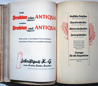
Schelter & Giesecke AG of Leipzig provided a small insert (“Deutsch das Land, Deutsch die Schrift”—German the Country, German the Type) dedicated to Standarte (a schaftstiefelgrotesk), shown alongside Parcival, Saskia (by Jan Tschichold) and Super-Grotesk. It precedes the most fascinating—and also the most elaborate—of the type specimens, “Fraktur oder Antiqua” from Schriftguss K.-G. (Brüder Butter) of Dresden. This is a double gatefold with the inside left side dedicated to Fraktur (symbolized by a pine tree) and the inside right side to Antiqua (symbolized by classical columns). This is the same dichotomy which Koch had illustrated in Die Schriftgiesserei im Schattenbild (Typefoundry in Silhouette) (Offenbach am Main: Klingspor, 1918). The front pairs blackletter and roman typefaces in a chronological order, thus matching Bodoni with Unger-Fraktur and National, a schaftstiefelgrotesk, with Super-Grotesk, a geometric sans serif. Inside the fonts displayed are blackletters National (“die neue deutsche Schrift!”), National schräg, Unger-Fraktur, Wieynck-Gotisch, Thannhaeuser-Schrift; romans Bodoni, Härtel-Antiqua, Divina, Lido, Appell, Energos, Diamant, Luxor and Super-Grotesk; and scripts Splendor and Originell.


The last page of the insert states, “Nicht Fraktur oder Antiqua sondern Fraktur und Antiqua. Beide werden in der täglichen Praxis benötigt—beide bieten wir Ihnen in neuzeitlichen Schnitten.” (“Not Fraktur or Roman but Fraktur and Roman. Both are necessary in day-to-day practice—we offer both to you in modern styles.” The last part refers to National and Super-Grotesk, a Futura copy.


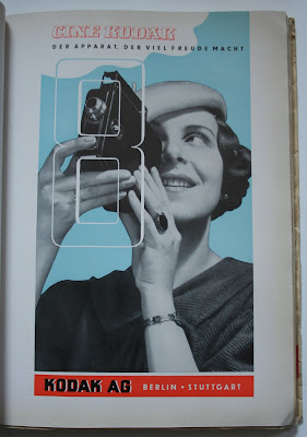
The non-foundry advertisers are: color manufacturers (dyes, paints, inks, etc.) I.G. Farbenindustrie Aktiengesellschaft-Agfa, Springer & Möller AG (sponsor of the Berufschule für das graphische Gewerbe Berlin pages), Berger & Wirth Farbenfabriken, Chr. Hostmann-Steinberg’sche Farbenfabriken, Gebr. Schmidt GmbH (with three advertisements, one designed by Goovaerts), Beit & Co. Chemische- und Farbenfabriken (2 advertisements), E.T. Gleitsmann, Schramm AG Druckfarben-Fabrik, Jänecke-Schneemann KG Druckfabriken, Deutsche Druckfarbenfabrik Zulch & Dr. Sckerl, and Kast & Ehinger GmbH Druckfarbenfabriken; printing press manufacturers Schnellpressenfabrik Koenig & Bauer AG, Chn. Mansfeld Maschinenfabrik, Koebau-Sturmvogel RE, and Karl Krause Maschinenfabrik, Planeta (manufacturer of offset printing presses celebrating its 40th anniversary); paper manufacturers Dresdner Chromo-und Kunstdruckpapierfabrik, Krause & Baumann A.G., Heidenau Bez. Dresden, Gebr. Ebart G.m.b.H., and Freiberger Papierfabrik zu Weißenborn; and printers Druckerei-Gesellschaft Hartung & Co., Deutscher Buchgewerbe-Verein of Leipzig, and Richard Petersen Grossbuchdruckerei. There are also advertisements by Beckmann-Verfahren D.R.P. and Kodak AG. The breakdown of typefaces used is:

Futura (11)

Kabel (1)

Venus (1)

sans serif handlettering (2)

Weiss-Antiqua with Kursiv

DeVinne (1)

Ratio-Latein (1)

Bodoni (3)

Beton (1)

Memphis (1)

an unidentified egyptian (1)

an unidentified egyptian italic (1)

an unidentified condensed egyptian (1)

an unidentified Englische Schreibschrift (1)

Legende (1)

Signal (1)

an unidentified script (1)

Weiss-Gotisch (1)

It is quite evident that blackletter and roman typefaces not only co-existed in German graphic design in 1938, but that they were consciously paired. Schaftstiefelgrotesks, although promoted heavily by the typefoundries, took a backseat to more traditional frakturs and texturas, both older designs and new ones such as Kleist-Fraktur and Zentenar. And when schaftstiefelgrotesks were used, they were often joined to geometric sans serifs in an attempt to project an air of modernity. Geometric sans serifs, especially Futura, continued to thrive. Among seriffed faces, the most popular were Bodoni and Baskerville.